GS Prelims Paper II Data Interpretation up to 2018
Civil Services Examination 2018
1. Consider the following graph:
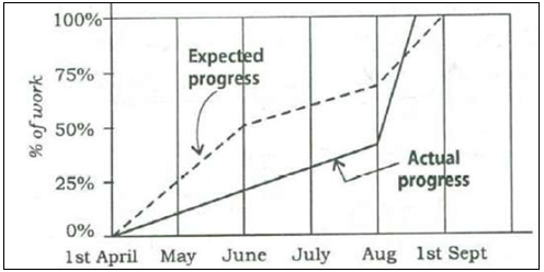
Which one of the following statements is not correct with reference to the graph given above?
- On 1st June, the actual progress of work was less than expected.
- The actual rate of progress of work was the greatest during the month of August.
- The work was actually completed before the expected time.
- During the period from 1st April to 1st September, at no time was the actual progress more than the expected progress.
Consider the following graph in which the birthrate and death rate of a country are given, and answer the two items that follow.
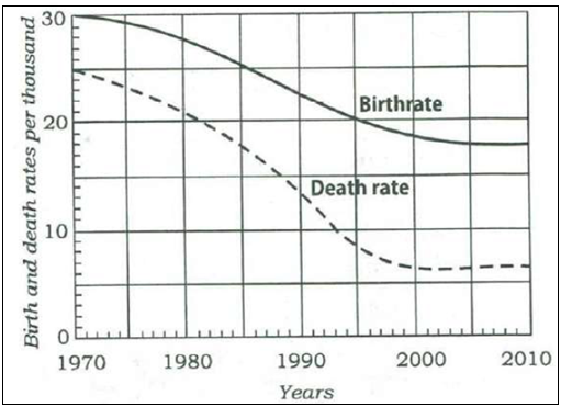
2. Looking at the graph, it can be inferred that from 1990 to 2010.
- population growth rate has increased
- population growth rate has decreased
- growth rate of population has remained stable
- population growth rate shows no trend
3. With reference to the above graph, consider the following statements considering 1970 as base year:
- Population has stabilized after 35 years.
- Population growth rate has stabilized after 35 years.
- Death rate has fallen by 10% in the first 10 years.
- Birthrate has stabilized after 35 years.
Which of the above are the most logical and rational statements that can be made from the above graph?
- 1 and 2 only
- 1, 2 and 3
- 3 and 4
- 2 and 4
Consider the following graphs. The curves in the graphs indicate different age groups in the populations of two countries A and B over a period of few decades:
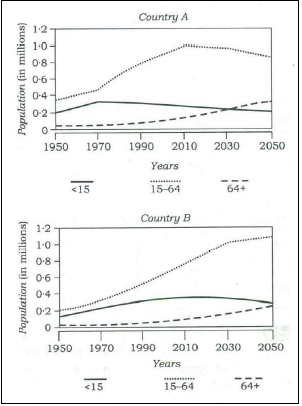
4. With reference to the above graphs, which of the following are the most logical and rational inferences that can be made?
- Over the last two and a half decades, the dependency ratio for country B has decreased.
- By the end of next two and a half decades, the dependency ratio of country A will be much less than that of country B.
- In the next two decades, the work-force relative to its total population will increase in country B as compared to country A.
Select the correct answer using the code given below:
- 1 and 2 only
- 2 and 3 only
- 1 and 3 only
- 1, 2 and 3
5. Consider the following figures A and B:
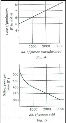
The manufacturing cost and projected sales for a product are shown in the above figures A and B respectively. What is the minimum number of pieces that should be manufactured to avoid a loss
- 2000
- 2500
- 3000
- 3500
6. The graph given below indicates the changes in key policy rates made by the Central Bank several times in a year:
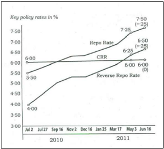
Which one of the following can be the most likely reason for the Central Bank for such an action?
- Encouraging foreign investment
- Increasing the liquidity
- Encouraging both public and private savings
- Anti-inflationary stance
Directions for the following 2 (two) items:
The following table gives the GDP growth rate and Tele-density data of different States of a country in a particular year. Study the table and answer the two items that follow:
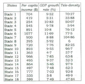
7. With reference to the above table, which of the following is/are the most logical and rational inference/ inferences that can be made?
- Higher per capita income is generally associated with higher Tele-density.
- Higher GDP growth rate always ensures higher per capita income.
- Higher GDP growth rate does not necessarily ensure higher Tele density.
Select the correct answer using the code given below:
- 1 only
- 2 and 3
- 1 and 3
- 3 only
8. With reference to the above table, the following assumptions have been made:
- Nowdays, prosperity of an already high performing State cannot be sustained without making further large investments in its telecom infrastructure.
- Nowadays, a very high Tele-density the most essential condition for promoting the business and economic growth in a State.
Which of the above assumptions is/are valid?
- 1 only
- 2 only
- Both 1 and 2
- Neither 1 nor 2
9. The following graph indicates the composition of our tax revenue for a period of two decades:
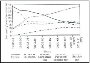
With reference to the above graph, which of the following is/are the most logical and rational inference/ inferences that can be made?
10. Average hourly earnings per year (E) of the workers in a firm are represented in figures A and B as follows:
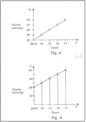
From the figures it is observed that
- values of E are different
- ranges (i.e., the difference between the maximum and the minimum) of E are different
- slopes of the graphs are same
- rates of increase of E are different
Directions for the following 3 (three) items:
The following three items are based on the graph given below which shows imports of three different types of steel over a period of six months of a year. Study the graph and answer the three items that follow.
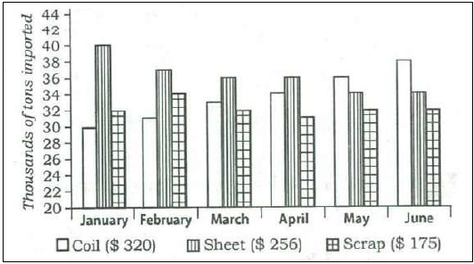
The figures in the brackets indicate the average cost per ton over six months period.
11. By how much (measured in thousands of tons) did the import of sheet steel exceed the import of coil steel in the first three months of the year?
- 11
- 15
- 19
- 23
12. What was the approximate total value (in $) of sheet steel imported over the six months period?
- 45,555
- 50,555
- 55,550
- 65,750
13. What was the approximate ratio of sheet steel and scrap steel imports in the first three months of the year?
- 1 : 1
- 1.2 : 1
- 1.4 : 1
- 1.6 : 1
Civil Services Examination 2017
1. If for a sample data, Mean < Median < Mode, then the distribution is
- symmetric
- skewed to the right
- neither symmetric nor skewed
- skewed to the left
Civil Services Examination 2016
1. Consider the following statements.
- The rate of population growth is increasing in the country
- The death rate is declining faster in the country compared to birth rate
- The birth rate is declining faster in the country compared to death rate
- Rural-urban migration is taking place regularly in the country
Which one of the following conclusions may be true in the light of the above facts?
- The rate of population growth is increasing due to rural-urban migration
- The rate of population growth is increasing due to decline in death rate only
- The rate of population growth is increasing due to increase in birth rate only
- The rate of population growth is increasing due to faster decline in death rate than in birth rate
Civil Services Examination 2015
1. An automobiles owner reduced his monthly petrol consumption when the prices went up. The price-consumption relationship is as follows:
Price (in Rs. Per litre) 40 50 60 75
Monthly consumption (in litres) 60 48 40 30
If the price goes up to Rs. 80 per litre, his expected consumption (in litres) will be
- 30
- 28
- 26
- 24
2. The graph below depicts the earnings of A and B over the period 2000 to 2010:
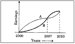
From the graph, which one of the following can be concluded?
- On the average A earned more than B during this period.
- On the average B earned more than A during this period.
- The earnings of A and B were equal during this period.
- The earnings of A were less as compared to B during this period.
3. Year-wise variation of the price of a certain commodity is shown in the following graph:
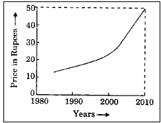
The price of the commodity in the year 1990
- must have been Rs. 10/-
- must have been Rs. 12/-
- must have been anywhere between Rs. 10/- and Rs. 20/-
- is higher than that in the year 1991
4. The proportion of expenditure on various items by two families A and B are represented in the following Bar Charts:
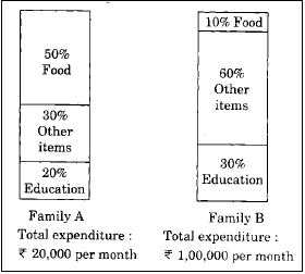
From these charts, we can conclude that
- Family A spent more money on food than Family B.
- Family B spent more money on food than Family A.
- Family A and Family B spent the same amount on food.
- The expenditure on food by Family A and Family B cannot be compared.
Civil Services Examination 2014
Directions for the following 4 (four) items:
The following graph shows the average profit of two fruit-sellers A and B in thousands (Rs ) per year from the year 1995 to 2000. Consider the graph and answer the 4 (four) items that follow:
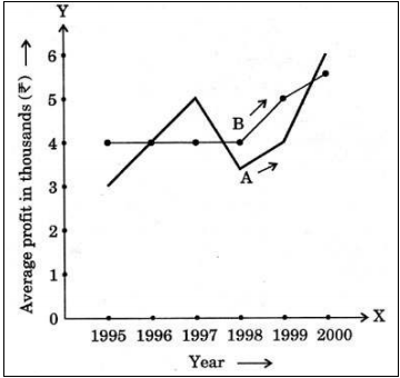
1. In which years is the average profit of A and B same?
- 1995
- 1996
- 1997
- 1998
2. What is the difference between the average profit of B and A in the year 1998?
- –100
- –1,000
- +600
- –300
3. How much more average profit did A make in the year 2000 than in the year 1999?
- 200
- 1,000
- 1,500
- 2,000
4. What is the trend of the average profit of B from the year 1997 to the year 2000?
- Non-increasing
- Non-decreasing
- Steady
- Fluctuating
5. The following table shows the marks obtained by two students in different subjects:
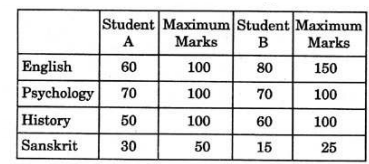
The difference in the mean aggregate percentage marks of the students is
- 2.5 %
- 13.75%
- 1.25 %
- Zero
6. The following table gives population and total income of a city for four years:
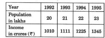
Which one of the following statements is correct in respect of the above data?
- Population increased by 5% or more every year.
- Income increased by 10% or more every year.
- Per capita income was always above Rs. 5,000.
- Per capita income was highest in 1994.
7. The following table shows the marks obtained by two students in different subjects:
The difference in the mean aggregate percentage marks of the students is
- 2.5 %
- 13.75%
- 1.25 %
- Zero
Civil Services Examination 2013
1. Consider the following diagrams:
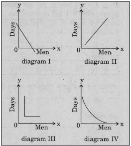
x men, working at constant speed, do a certain job in y days. Which one of these diagrams shows the relation between x and y?
- diagram I
- diagram II
- diagram III
- diagram IV
2. Four cars are hired at the rate of Rs. 6 per km plus the cost of diesel at Rs. 40 a litre. In this context, consider the details given in the following table:
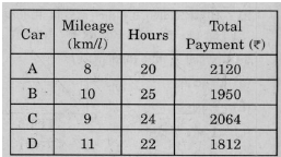
Which car maintained the maximum average speed?
- Car A
- Car B
- Car C
- Car D
Direction for the following 5 (five) items:
Study the two figures given below and answer the five items that follow:
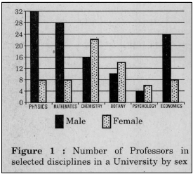
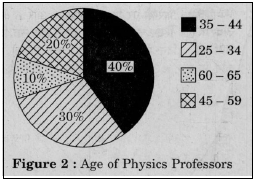
3. How many Physics professors belong to the age group 35 - 44?
- 18
- 16
- 14
- 12
4. Which one of the following diciplines has the highest ratio of males to females?
- Physics
- Mathematics
- Chemistry
- Economics
5. What percentage of all Psychology professors are females?
- 40%
- 50%
- 60%
- 70%
6. If the number of female Physics professors in the age group 25 - 34 equals 25% of all the Physics professors in that age group, then what is the number of male Physics professors in the age group 25 - 34?
- 9
- 6
- 3
- 2
7. If the Psychology professors in the University constitute 2% of all the professors in the University, then what is the number of professors in the University?
- 400
- 500
- 600
- 700
Civil Services Examination 2012
1. Consider the following information regarding the performance of class of 1000 students in four different tests:
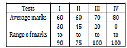
If a student scores 74 marks in each of the four tests, in which one of the following tests is her performance the best comparatively?
- Test I
- Test II
- Test III
- Test IV
2. In the above figure, circle P represents hardworking people, circle Q represents intelligent people, Circle R represents truthful people and circle S represents honest people. Which region represents the people who are intelligent, honest and truthful but not hardworking?
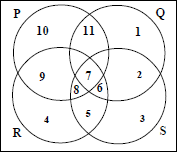
- 6
- 7
- 8
- 11
Civil Services Examination 2011
1. Consider the four age pyramids given below namely A, B, C and D representing four different countries.
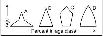
Which one of them indicates the declining population?
- A
- B
- C
- D
2. The followings figures has four curves namely A, B, C and D, Study the figure and answer the item
that follows.
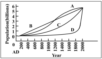
Which curve indicates the exponential growth?
- A
- B
- C
- D
Directions for the following 2 (two) items:
- The following pie charts show the break-up of disease categories recorded in the patients from two
- towns, Town A and Town B. Pie charts plot the disease Categories as percentage of the total number
- of patients. Based on these, answer the two items that follow the charts.
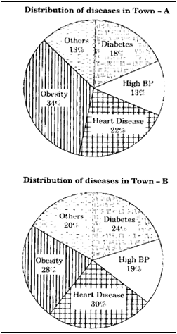
3. Which of the two towns has a higher number of persons with Diabetes?
- Town A
- Town B
- Same in Town A and Town B
- No inference can be drawn
4. What can we say about persons with more than one disease from these graphs?
- There are likely to be persons with more than one disease in Town A.
- There are likely to be persons with more than one disease in Town B.
- There are likely to be persons with more than one disease in both Towns A and B.
- No inference can be drawn.
5. Consider the following Velocity-Time graph. It shows two trains starting simultaneously on parallel tracks.
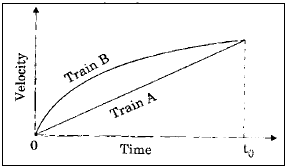
With reference to the above graph, which one of the following statements is not correct ?
- Train B has an initial acceleration greater than that of Train A.
- Train B is faster than Train A at all times.
- Both trains have the same velocity at time to'
- Both trains travel the same distance in time to units.
6. Consider the following distance - time graph. The graph shows three athletes A, B and C running side by side for a 30 km race.
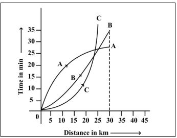
With reference to the above graph consider the following statements:
- the race was won by A.
- B was ahead of A up to 25 km 26 mark.
- C ran very slowly from the begining.
Which of the statements given above is/are correct ?
- 1 only
- 1 and 2 only
- 2 and 3 only
- 1, 2 and 3
Directions for the following 3 (Three) items:
Read the passage given below, study the graph that follows and answer the three items given below the figure.
During a party, a person was exposed to contaminated water. A few days later, he developed fever and loose motions. He suffered for some days before going to a doctor for treatment. On starting the treatment, he soon became better and recovered completely a few days later. The following graph shows different phases of the person's disease condition as regions A, B, C, D and E of the curve.
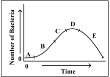
7. Which region/regions of the curve correspond/corresponds to incubation phase of the infection?
- A only
- B only
- Band C
- No part of the curve indicates the incubation phase
8. Which region of the curve indicates that the person began showing the symptoms of infection?
- A
- B
- C
- D
9. Which region of the curve indicates that the treatment yielded effective relief?
- C
- D
- E
- The curve does not indicate the treatment
Read the following passage and answer the 3 (three) items that follow:
In a survey regarding a proposal measure to be introduced, 2878 person took part of which 1652 were males, 1226 persons voted against the proposal which 796 were males. 1425 persons vote for the proposal. 196 females were undecided.
10. How many females voted for the proposal?
- 430
- 600
- 624
- 640
11. How many males were undecided?
- 31
- 227
- 426
- 581
12. How many females were not in favour of the proposal?
- 430
- 496
- 586
- 1226
